Download free templates, or make the switch to digital-only.
This article originally appeared in Nature Index.

A few years ago, presenting a poster at a scientific conference inevitably meant battling with thumbtacks, rubber bands, and an unwieldly sail of paper with little power to inspire. Now researchers are increasingly opting for digital posters and templated designs that highlight – rather than obscure – their key findings.
I recently attended the 2019 annual meeting of the American Geophysical Union (AGU) in San Francisco, where 17,909 scientific posters were displayed over the course of a week. Many of these posters were visually arresting and cleverly constructed. And some were entirely online.
Since 2017, the AGU has been inviting presenters to submit digital poster ideas. Known as iPosters, they can support videos and animations, and are displayed on giant, interactive touch-screens.
That year, 117 iPoster submissions were approved for display at the conference. In 2018, that number had jumped to 775 iPosters, and last year, there were 995.
“The audience is jazzed about them,” says AGU executive program manager, Erik Hankin. “There’s an excitement around the technology and how it can overcome the limitations of a paper poster.”
The digital poster’s advantages go far beyond not having to lug around a 40-inch cardboard tube. Presenters can easily make last-minute changes to the content, and they can be instantly converted to other digital formats so they can be shared or uploaded to a website.
“I like not having to deal with the university printing office or worry about leaving it on the train,” says Leah Wood, a PhD student from Indiana University-Purdue University Indianapolis. “And I think it’s more engaging.”
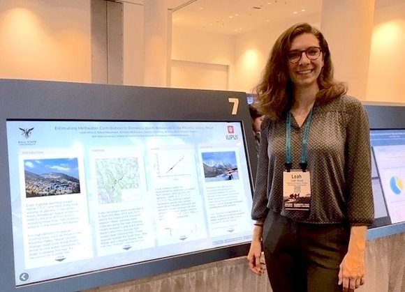
The AGU asked iPoster presenters to give brief talks about their research (called eLightning talks), and those were a hit as well.
“I think it’s the best of both worlds between giving an oral presentation and a poster presentation,” says Wood. “These three-minute talks are just right to give an elevator pitch and encourage people to come and play with the poster.”
Paper posters aren’t done yet
The downside of running a digital poster session is that it costs more than a conventional poster session, and someone has to foot the bill.
Conference organizers pay aMuze Interactive, a US- and Sweden-based company, for the use of proprietary iPoster software, and often a second company to truck in the special monitors and display hardware.
Some conferences can charge as much as $1,000 extra to participants who present digital posters to cover these expenses.
If that cost precludes you from going digital, progress has touched the paper side of the poster hall, too.
We’ve also seen improvements in the design of scientific posters. In 2019, Mike Morrison, a PhD student in psychology at Michigan State University, created a viral video calling out the inadequacy of conventional posters and introducing his own free downloadable poster templates called betterposters.
Morrison’s betterposter design includes small portraits of each author so conference-goers can recognize their faces in a crowd. They also include QR codes that can be scanned to bring up the relevant paper and other supplementary material on a user’s smartphone.
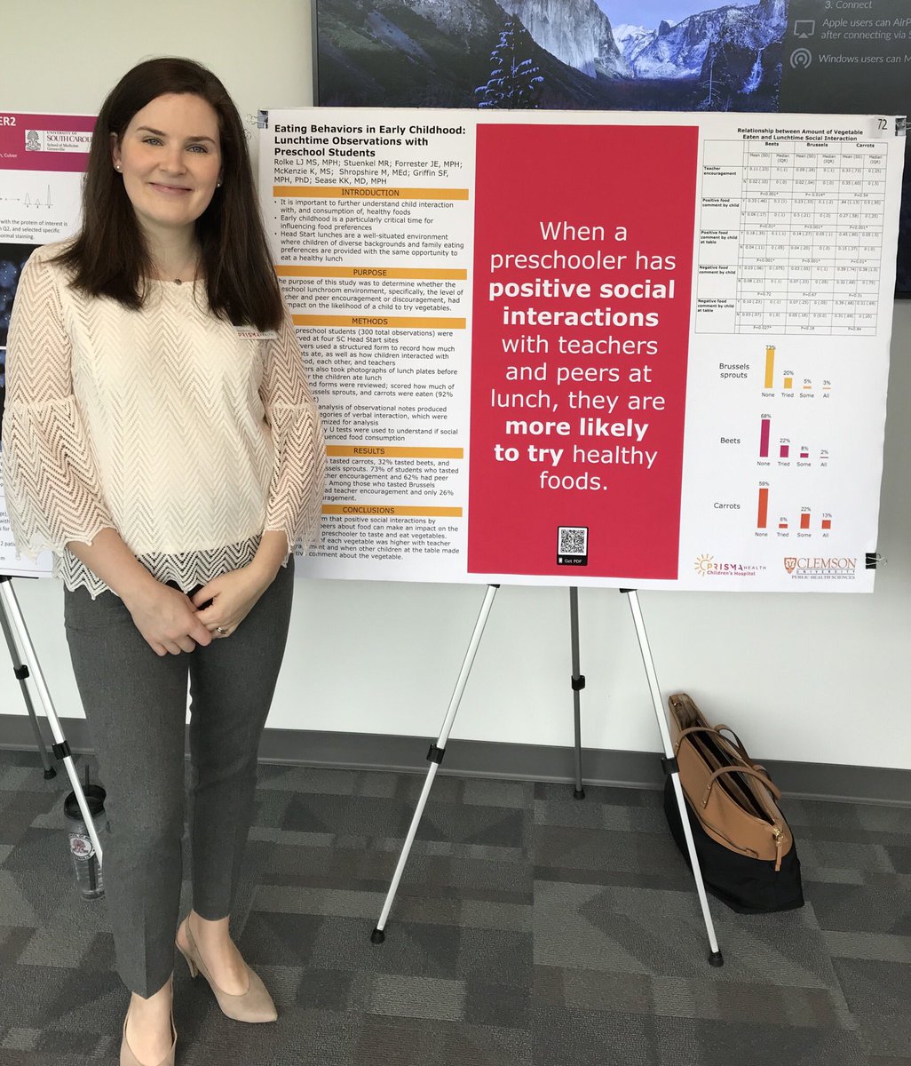
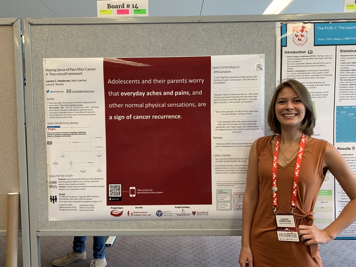
But the hallmark of the betterposter is a big dark square, smack in the middle of the poster, containing a single sentence that states the primary result of the research. It’s written so large that it’s impossible for conference-goers not to read it as they walk by
my first attempt at a #betterposter come find out what happens! #ELSO2019

8410:25 AM – Sep 14, 2019 · Austin, TXTwitter Ads info and privacy18 people are talking about thi
@drdavidliew presents his poster #2685 #ACRbest #ACR19 @RheumNow come check out the Australian Experience of TA bx.

710:35 AM – Nov 12, 2019Twitter Ads info and privacySee Dr. Rachel Tate’s other Tweets
My colleague, Petr Pokorny, a planetary science postdoc from the Catholic University of America in Washington and NASA’s Goddard Space Flight Center in Maryland, tried using a betterposter template for the first time at the 2019 AGU meeting.
“It was a huge success. I got about 100 people stopping to read the poster and take pictures of it,” says Pokorny. “And it was a pretty dead part of the room.”

Learn from the best
My hope for the future of conference posters is to see the aMuze iPoster templates incorporate some of the clever elements of the betterposter concept.
Although the digital posters I saw last year were easy enough to interact with, I often found myself struggling to understand the main point of the research being presented.
The betterposter templates are designed to put the “so what?” factor at the front and centre of the presentation – quite literally – which often solves this problem.
Here are some of my favourites that have been posted to Twitter:
Jacqueline Forrester@jacforrester
@ghs_org Health Sciences Center Research Showcase today – lots of great feedback on our #betterposter design! @Laura_MPH
152:00 PM – Apr 12, 2019Twitter Ads info and privacySee Jacqueline Forrester’s other Tweets
Presenting research at @metals_in in Paris this week! Got creative with this one following some inspiration from @mikemorrison. *Note the skull decorated with orbitals to represent cytotoxicity! #CHEMISTRY #betterposter #Paris

256:13 AM – Nov 15, 2019Twitter Ads info and privacySee Miles S Capper’s other Tweets
Giving the #betterposter template a go at #NAPCRG2019 and have caught some eyeballs. Success
Come learn about primary care patient volume and quality of care for complex patients with me

961:01 PM – Nov 19, 2019Twitter Ads info and privacy21 people are talking about this
Lauren Heathcote, PhD@LCHeathcote
Thank you #IPOS2019 for the opportunity to present my research on #symptom perception in #AYAcancer survivors today.
My first #betterposter design was seemingly a success 🙂
1075:41 PM – Sep 24, 2019 · Kinnear Centre For Creativity & InnovationTwitter Ads info and privacySee Lauren Heathcote, PhD’s other Tweets
Search the #betterposter hashtag on Twitter to see more examples.
And to avoid that crushing feeling that results from unfurling a crinkled poster, you can also order a cloth fabric poster at makesigns.com or postersmith.com.
